
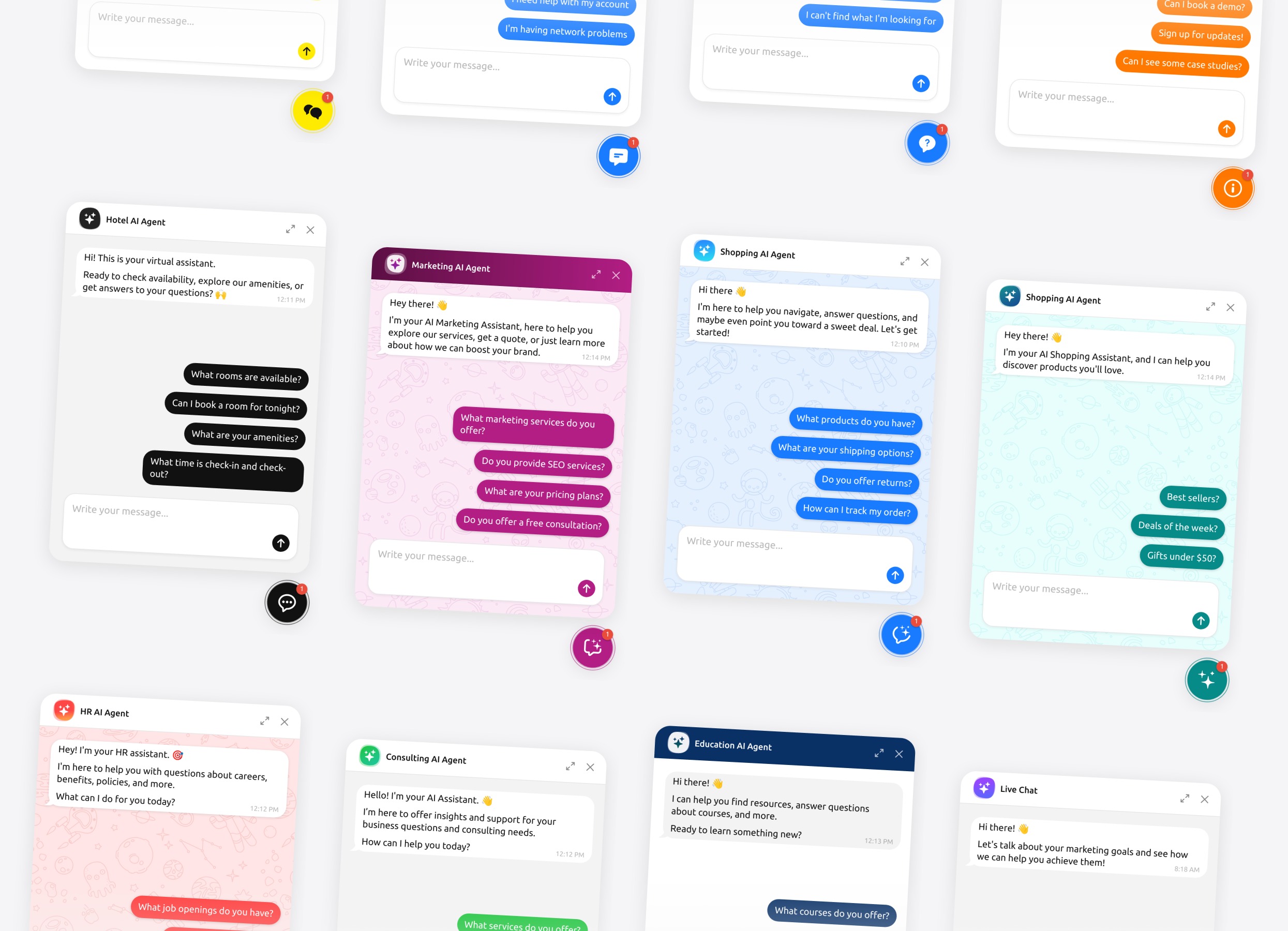
What this page is
Everything the AI Chatbot widget can do, in one place. If you are comparing tools in detail, this is the page to read.
Two layouts
Floating — a launcher sits on the page and the chat opens over it. This is the default and what most sites use.
Embedded — the chat sits inside a block on the page at a width and height you set. Good for a dedicated help page or a contact page.
On desktop the floating window can be moved and resized by the visitor.
Four launcher styles
Four launcher styles:
- Button — an icon bubble
- Text button — a labelled button
- Quick input — a small message field on the page, so people can start typing without opening anything
- Agent profile — an avatar-style launcher
Position it bottom left, bottom right or bottom centre, with your own horizontal and vertical offset.
Six themes and full colour control
Six themes: Light, Light Accent, Light Soft, Pattern Light, Pattern Accent, Dark.
Then colour control over the launcher, the header, the chat window, message bubbles, the message field and the footer — plus your own font, your own corner radius, and a background that can be a colour, an image or a pattern.
If that is still not exact enough, there is custom CSS and custom JavaScript.
What visitors can do in the chat
What a visitor can do in the chat:
- Attach files — PDF, JPG, PNG, WEBP, TXT, CSV, MD — by button, paste or drag and drop
- Rate an answer up or down, and copy the text of any reply
- Download a transcript of the conversation for themselves
- Start a new chat, and mute the sounds if they are on
Attachments are capped per message and per conversation, so nobody can fill your storage with one drag.
How answers appear
Small things that add up to it feeling like a person:
- Replies stream in as they are written rather than appearing all at once
- A typing indicator and a thinking state while it works
- Formatting in replies, and links that open in a new tab
- A message that failed to send can be retried